Accordion
Build vertically collapsing accordions in combination with our Collapse JavaScript plugin. Please see the official Bootstrap documentation for a full list of options.
.accordion-body, though the transition does limit overflow.
.accordion-body, though the transition does limit overflow.
.accordion-body, though the transition does limit overflow.
Alerts
Provide contextual feedback messages for typical user actions with the handful of available and flexible alert messages. Please see the official Bootstrap documentation for a full list of options.
Well done!
Aww yeah, you successfully read this important alert message. This example text is going to run a bit longer so that you can see how spacing within an alert works with this kind of content.
Whenever you need to, be sure to use margin utilities to keep things nice and tidy.
Autosize
A small, stand-alone script to automatically adjust textarea height. You can pass any options supported by the plugin via the data-options attribute. The value must be a valid JSON object. Please read the official plugin documentation for a full list of options.
Avatars Dashkit only
Create and group avatars of different sizes and shapes with a single component.
Sizing
Using Bootstrap’s typical naming structure, you can create a standard avatar, or scale it up to different sizes based on what’s needed.
Status Indicator
Add an online or offline status indicator to show user's availability.
Shape
Change the shape of an avatar with the default Bootstrap image classes.
Ratio
Change the proportional relationship between the width and height of an avatar to 4 by 3 with an .avatar-4by3 modifier.
Initials
You won't always have an image for every user, so easily use initials instead.
Groups
Easily group avatars of any size, shape and content with a single component. Each avatar can also use an <a> to link to the corresponding profile.
Badges
A small count and labeling component. Please read the official Bootstrap documentation for a full list of options.
Subtle Dashkit only
Creates a subtle variant of a corresponding contextual badge variation. These can be used exactly like Bootstrap's core badges, including modiying classes like .rounded-pill, as an <a> itself, or inside of <button> or <a> elements.
Cards
Bootstrap’s cards provide a flexible and extensible content container with multiple variants and options. Please read the official Bootstrap documentation for a full list of options.
Card title
Lorem ipsum dolor sit amet, consectetur adipisicing elit. Facilis non dolore est fuga nobis ipsum illum eligendi nemo iure repellat, soluta, optio minus ut reiciendis voluptates enim impedit veritatis officiis.
Go somewhereCard header Dashkit only
Easily create a card header of a fixed height and populate it with text, buttons, or a navigation.
Card title
Lorem ipsum dolor sit amet, consectetur adipisicing elit. Perspiciatis fugiat dolorem, expedita rem. Quis natus officiis asperiores rem ipsum, dolore cumque voluptatum iste vel alias, recusandae culpa hic pariatur quos.
Card header navigation Dashkit only
Use the default Bootstrap grid and the .nav component to easily add a perfectly aligned navigation inside a card header.
Card title
Lorem ipsum dolor sit amet, consectetur adipisicing elit. Officiis tempora architecto, sit a repellat dignissimos consequatur mollitia qui consequuntur recusandae numquam voluptate maiores, non cumque illo laboriosam sint dolores. Nostrum.
Inactive Dashkit only
Merge your card into a background with the .card-inactive modifier.
Fill Dashkit only
Make a card fill the whole available space to fit the height of a neighboring card with a .card-fill modifier.
Traffic Channels
Weekly Sales
$24,500 +3.5%Orders Placed
763.5Conversion Rate
Avg. Order VaLue
$85.50Adjust Dashkit only
Make a card vertically shrink (with a scrollbar) to match the height of its neighboring card with a .card-adjust modifier.
Recent Activity
View allLaunchday 1.4.0 update email sent
Sent to all 1,851 subscribers over a 24 hour period
2m agoLaunchday 1.4.0 update email sent
Sent to all 1,851 subscribers over a 24 hour period
2m agoLaunchday 1.4.0 update email sent
Sent to all 1,851 subscribers over a 24 hour period
2m agoLaunchday 1.4.0 update email sent
Sent to all 1,851 subscribers over a 24 hour period
2m agoPopular Content
Export| Page Title | Pageviews | Pageview % | Time/Page | |
|---|---|---|---|---|
| Homepage | 97,028 | 35.5% | 2:14 | |
| Blog | 7,283 | 9.7% | 1:53 | |
| My Account | 5,782 | 6.7% | 2:03 | |
| Why Dashkit? | 5,012 | 5.9% | 0:45 | |
| Documentation | 2,230 | 2.4% | 6:10 | |
Profile Dashkit only
Combine the default Bootstrap and Dashkit components to create beautiful large and small profile cards.

Team Dashkit only
A similar to profile cards team component compiled of the default Bootstrap and Dashkit components.
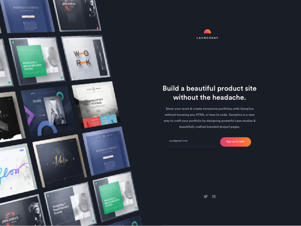
Launchday
Launchday is a SaaS website builder with a focus on quality, easy to build product sites.
Updated 2hr ago
Project Dashkit only
Another combination of the default Bootstrap and Dashkit components that scales perfectly to look good on screens of any size.
Files Dashkit only
A .card component variation perfect to create a list of files available for download.
Statcards Dashkit only
Create beautiful statcards with the default .card component and the combination of the Bootstrap components and icons.
Budget
$24,500 +3.5%Posts Dashkit only
A combination of the .card component, illustrations and margin utilities.

We released 2008 new versions of our theme to make the world a better place.
This is a true story and totally not made up. This is going to be better in the long run but for now this is the way it is.
Try it for freePricing Dashkit only
A .card component variation for a pricing option.
Basic plan
- Unlimited activity
- Direct messaging
- Members 10 members
- Admins No access
Kanban Dashkit only
A .card component variation for a kanban item.
Create the release notes for the new pages so customers are warned.
Jun 9
Create the release notes for the new pages so customers are warned.
Charts Dashkit only Plugin
Create beautiful charts with a simple, but powerful and flexible JavaScript Chart.js plugin. Please read the official documentation for a full list of options.
Line
A line chart is a way of plotting data points on a line. Often, it is used to show trend data, or the comparison of two data sets.
Bar
A bar chart provides a way of showing data values represented as vertical bars. It is sometimes used to show trend data, and the comparison of multiple data sets side by side.
Doughnut
Excellent at showing the relational proportions between data.
Sparkline
A simple little line chart with disabled interactions.
Toggle chart data
Easily toggle hidden datasets with a simple interface based on the data attributes.
Options
| Name | Type | Default | Description |
|---|---|---|---|
data-toggle
|
string | chart | Activates the toggle functionality. |
data-target
|
string | - | The selector of a chart the new set of data will be applied to. |
data-trigger
|
string | - | How datasets are triggered. Should be a valid JavaScript event. |
data-action
|
string | - |
Use toggle to replace an active dataset, or add to add a new one.
|
data-dataset
|
number | - |
The order of the dataset in the datasets array to toggle.
|
Conversions
Last year comparision:Sales
Please refer to src/js/user.js for more examples.
Checklist Dashkit only
Sortable checklist component powered by Draggable.js. Please read the official plugin documentation for a full list of options.
Dropdowns
Toggle contextual overlays for displaying lists of links and more with the Bootstrap dropdown plugin. Please read the official Bootstrap documentation for a full list of options.
Dropdown ellipsis Dashkit only
Creates a compact dropdown toggler with a Feather icon.
Dropdown card Dashkit only
Turns the default Bootstrap dropdown menu into a fully functional .card component. The height of the .card-body container will be limited and a scrolling bar will appear once this height is exceeded.
Forms
Dashkit supports all of Bootstrap's default form styling in addition to a handful of new input types and features. Please read the official documentation for a full list of options from Bootstrap's core library.
Floating labels
Create beautifully simple form labels that float over your input fields.
Validation
Indicate invalid and valid form fields with .is-invalid and .is-valid classes.
Rounded Dashkit only
Round form control corners with the .form-control-rounded modifier.
Flush Dashkit only
Remove vertical padding and borders from a form control with the .form-control-flush modifier.
Auto Dashkit only
Remove vertical padding and set form control's height to auto with the .form-control-auto modifier.
Input group merge Dashkit only
A slightly modified version of the default input groups that always keeps icons as a part of the form control.
Switch
Replaces a standard checkbox input with a toggle switch.
Date picker Dashkit only Plugin
A simple yet powerful datepicker powered by the Flatpickr JavaScript plugin. You can pass any options supported by
the plugin via the data-flatpickr attribute. The value must be a valid JSON object. Please read the
official plugin documentation for a full list of options.
Input masking Dashkit only Plugin
Mask your form controls depending on the context with the Inputmask plugin. Please read the official plugin documentation for a full list of options.
Rich text editor Dashkit only Plugin
Powerful WYSIWYG text editor powered by Quill. You can pass any options supported by the plugin via the
data-quill attribute. The value must be a valid JSON object. Please read the
official plugin documentation for a full list of options.
Drag and drop Dashkit only Plugin
Drag and drop file uploads with image previews powered by Dropzone.js. You can pass any options supported by the
plugin via the data-dropzone attribute. The value must be a valid JSON object. Please read the
official plugin documentation for a full list of options.
Choices Dashkit only Plugin
A vanilla, lightweight, configurable select box/text input plugin. Similar to Select2 and Selectize but without the
jQuery dependency. You can pass any options supported by the plugin via the data-choices attribute. The
value must be a valid JSON object. Please read the
official plugin documentation for a full list of
options.
Icons Dashkit only
Simply beautiful icons powered by the Feather icons. Please see the official plugin documentation for a full list of icons.
Kanban Dashkit only
Kanban board powered by Draggable.js. Please read the official plugin documentation for a full list of options.
Create the release notes for the new pages so customers are warned.
Jun 9
Create the release notes for the new pages so customers are warned.
Jun 9
Rows Dashkit only
Vertical variation of the kanban board.
Create the release notes for the new pages so customers are warned.
Create the release notes for the new pages so customers are warned.
List group
List groups are a flexible and powerful component for displaying a series of content. Modify and extend them to support just about any content within. Please read the official Bootstrap documentation for a full list of options.
- Cras justo odio
- Dapibus ac facilisis in
- Morbi leo risus
- Porta ac consectetur ac
- Morbi leo risus 1
List group large Dashkit only
Increase the vertical padding of list group items with the .list-group-lg modifier.
- Cras justo odio
- Dapibus ac facilisis in
- Morbi leo risus
- Porta ac consectetur ac
- Vestibulum at eros
List group focus Dashkit only
Changes the color of the .text-focus elements to $primary on .list-group-item focus event. Useful for clickable .list-group-item elements when navigating with a keyboard.
List.js Dashkit only Plugin
Create searchable, sortable, and filterable lists and tables with the simple but powerful List.js plugin. Either initialize List.js via JavaScript as suggested in the documentation, or use our custom data-list attribute to initialize it via HTML. Please read the official plugin documentation for a full list of options.
Add a member
Timeline/activity Dashkit only
Turn a list group into a timeline/activity list by adding a .list-group-acitivity modifier and/or modified avatars.
Notification Timeline
View allLaunchday 1.4.0 update email sent
Sent to all 1,851 subscribers over a 24 hour period
2m agoLaunchday 1.4.0 update email sent
Sent to all 1,851 subscribers over a 24 hour period
2m agoLaunchday 1.4.0 update email sent
Sent to all 1,851 subscribers over a 24 hour period
2m agoActivity List
View allLaunchday Update email sent to 1,851 subscribers over a 24 hour period for maximum open and reply rates.
2m agoLaunchday Update email sent to 1,851 subscribers over a 24 hour period for maximum open and reply rates.
2m agoLaunchday Update email sent to 1,851 subscribers over a 24 hour period for maximum open and reply rates.
2m agoMap Dashkit only
To enable the Mapbox map on your website, you'll need a Mapbox access token. Mapbox uses access tokens to associate API requests with your account. You can create a new access token on your Access Tokens page or programmatically using the Mapbox Tokens API. Once a new access token is created, please replace the original access token at src/assets/js/map.js with the new one.
Modals
Use Bootstrap’s JavaScript modal plugin to add dialogs to your site for lightboxes, user notifications, or completely custom content. Please read the official Bootstrap documentation for a full list of options.
Offcanvas
Build hidden sidebars into your project for navigation, shopping carts, and more with a few classes and our JavaScript plugin. Please see the official Bootstrap documentation for a full list of options.
Page headers Dashkit only
The page header component that can be easily extended with other Bootstrap and Dashkit components.
Basic
The basic page header with a preheading and a heading.
Members
Dianna Smiley
Button
The basic page header extended with a button.
Members
Dianna Smiley
Nav
The basic page header extended with a tabbed navigation.
Members
Dianna Smiley
Button + nav
The basic page header extended with a button and a tabbed navigation.
Members
Dianna Smiley
Avatar + nav
The basic page header extended with an avatar group and a tabbed navigation.
Cover image
A complex page header variation with an image, avatar and other optional components.

Chart
A complex page header variation with a tabbed navigation and a chart.
Annual
Audience
Pagination
Indicates a series of related content exists across multiple pages. Please see the official Bootstrap documentation for a full list of options.
Placeholders
Use loading placeholders for your components or pages to indicate something may still be loading. Please see the official Bootstrap documentation for a full list of options.
Popovers
Please see the official Bootstrap documentation for a full list of options.
Progress
Please see the official Bootstrap documentation for a full list of options.
Small Dashkit only
The progress bar component with its bar height decreased.
Social posts Dashkit only
A variation of the card component featuring Dashkit comments.
I've been working on shipping the latest version of Launchday. The story I'm trying to focus on is something like "You're launching soon and need to be 100% focused on your product. Don't lose precious days designing, coding, and testing a product site. Instead, build one in minutes."
What do you y'all think? Would love some feedback from @Ab or @Adolfo?

Ab Hadley
Looking good Dianna! I like the image grid on the left, but it feels like a lot to process and doesn't really show me what the product does? I think using a short looping video or something similar demo'ing the product might be better?
Adolfo Hess
Any chance you're going to link the grid up to a public gallery of sites built with Launchday?
Spinners
Indicate the loading state of a component or page with Bootstrap spinners. Please read the official Bootstrap documentation for a full list of options.
Colors
The border spinner uses currentColor for its border-color, meaning you can customize the color with text color utilities. You can use any of our text color utilities on the standard spinner.
Buttons
Use spinners within buttons to indicate an action is currently processing or taking place. You may also swap the text out of the spinner element and utilize button text as needed.
Card
Use spinners within cards to indicate its content is currently loading.
Tables
Please read the official Bootstrap documentation for a full list of options.
| # | First | Last | Handle |
|---|---|---|---|
| 1 | Mark | Otto | @mdo |
| 2 | Jacob | Thornton | @fat |
| 3 | Larry | the Bird |
| # | First | Last | Handle |
|---|---|---|---|
| 1 | Mark | Otto | @mdo |
| 2 | Jacob | Thornton | @fat |
| 3 | Larry | the Bird |
| # | First | Last | Handle |
|---|---|---|---|
| 1 | Mark | Otto | @mdo |
| 2 | Jacob | Thornton | @fat |
| 3 | Larry | the Bird |
No wrap Dashkit only
Prevents table cell content from wrapping to another line
| # | First | Last | Handle | Decription |
|---|---|---|---|---|
| 1 | Mark | Otto | @mdo | Lorem ipsum dolor sit amet, consectetur adipisicing elit. |
| 2 | Jacob | Thornton | @fat | Lorem ipsum dolor sit amet, consectetur adipisicing elit. |
| 3 | Larry | the Bird | Lorem ipsum dolor sit amet, consectetur adipisicing elit. |
Sorting Dashkit only Plugin
Adds a sorting functionality to your tables powered by List.js. Please read the official plugin documentation for a full list of options or the lists section of the current documentation for custom initialization options.
Toasts
Push notifications to your visitors with a toast, a lightweight and easily customizable alert message. Please read the official Bootstrap documentation for a full list of options.
Tooltips
Please read the official Bootstrap documentation for a full list of options.
Typography
Dashkit makes use of the Cerebri Sans webfont for both headings and body content.
h1. Bootstrap heading
h2. Bootstrap heading
h3. Bootstrap heading
h4. Bootstrap heading
h5. Bootstrap heading
h6. Bootstrap heading
Lorem ipsum dolor sit amet, consectetur adipisicing elit, sed do eiusmod tempor incididunt ut labore et dolore magna aliqua.
Lorem ipsum dolor sit amet, consectetur adipisicing elit, sed do eiusmod.
Utilities
Please visit the official Bootstrap documentation for a full list of utilities. Additionally, the following utilities have been added:
Backgrounds Dashkit Only
-
.bg-fixed-bottomto fix the background image at the bottom of the.maincontainer at the feed.html page. -
.bg-coverto set thebackground-imagesize of an element tocover. -
.bg-vibrantto apply a background image with a vibrant gradient for the sidebar. -
.bg-lighterto set the backgroud color to the value of the$lighterSCSS variable.
<div class="bg-fixed-bottom" style="background-image: url(assets/img/illustrations/sticky.svg);">...</div>

<div class="bg-cover" style="background-image: url(...);">...</div>

<nav class="navbar navbar-vertical fixed-start navbar-expand-md navbar-dark bg-vibrant">...</div>

<div class="bg-lighter">...</div>
Sizing Dashkit only
-
.vw-100to change the width of an element to100vw. -
.vh-100to change the height of an element to100vh.
<div class="vw-100 vh-100">...</div>
Borders Dashkit only
-
.border-2(3, 4, 5), .border-top-2(3, 4, 5), .border-end-2(3, 4, 5), .border-bottom-2(3, 4, 5), .border-start-2(3, 4, 5)to increase the width of a border.
<div class="border border-2 border-white">...</div>
Lift Dashkit only
-
.lift(-lg)to visually lift an element on hover and focus.
<a class="btn btn-white lift">
  Hover to lift
</a>

<a class="btn btn-white lift lift-lg">
  Hover to lift
</a>
Type Dashkit only
-
.text-decoration-underlineto set the text decoration property to underline.
<a class="text-decoration-underline" href="#!">...</a>
Ab Hadley
Looking good Dianna! I like the image grid on the left, but it feels like a lot to process and doesn't really show me what the product does? I think using a short looping video or something similar demo'ing the product might be better?