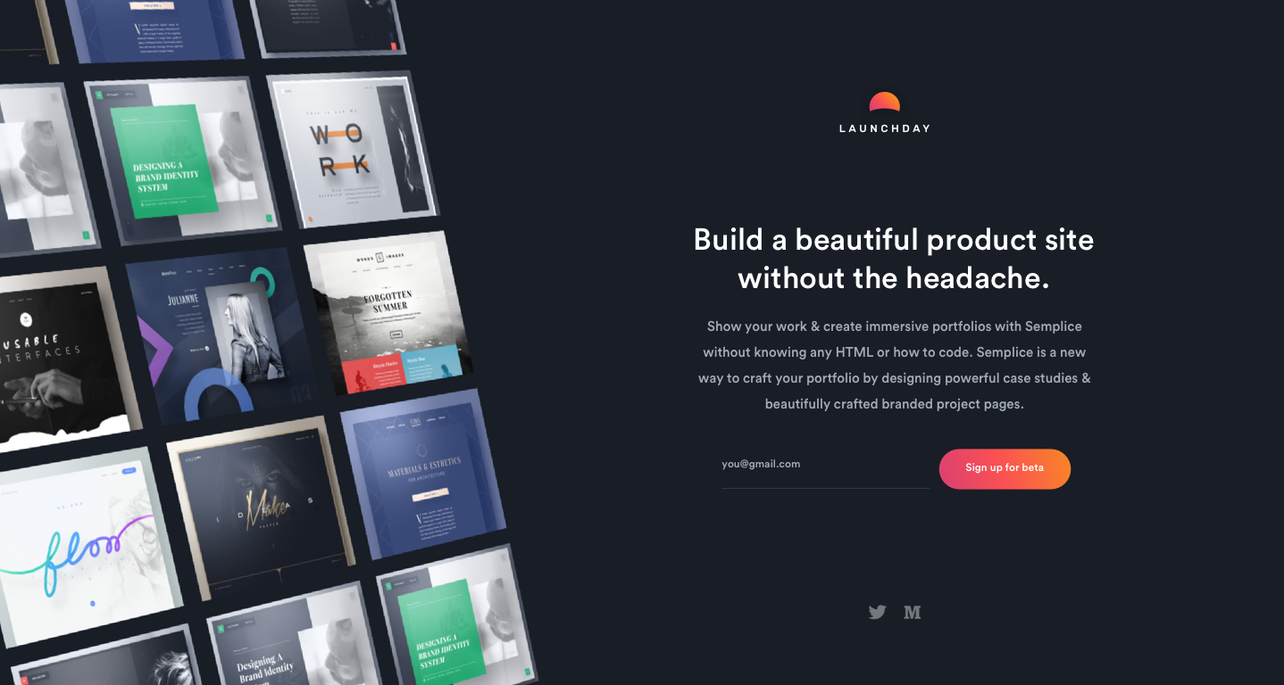
I've been working on shipping the latest version of Launchday. The story I'm trying to focus on is something like "You're launching soon and need to be 100% focused on your product. Don't lose precious days designing, coding, and testing a product site. Instead, build one in minutes."
What do you y'all think? Would love some feedback from @Ab or @Adolfo?

I've spent a lot of time thinking about our design process and trying to figure out a better order for us to tackle things. Right now it feels like we're everywhere with tools and process, so here's my suggestion:
- Define the goals: Create a template for expressing what the purpose of a project is and why we're investing time and money in tackling it.
- Sketch a solution: Use tried and true paper and pencil to express ideas and share them with others at the company before going too deep on design.
- User test with Figma: Use the page linking in Figma to get a rough clickable prototype and test this with real users.
- Prototype with code: Built and HTML/CSS with dummied data to test how things feel before building a true front-end.
Wanna help me out @Ryu Duke or @Miyah Miles?
Ab Hadley
Looking good Dianna! I like the image grid on the left, but it feels like a lot to process and doesn't really show me what the product does? I think using a short looping video or something similar demo'ing the product might be better?