Documentation
Design File
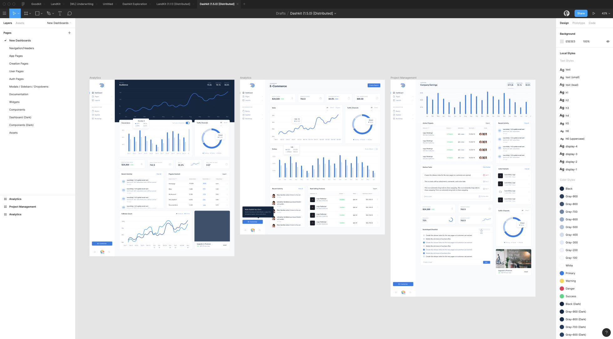
Dashkit was designed in Figma, the best new design tool.
Why Figma?
While Figma is a relatively new design tool, it has taken the top spot in our design toolkit. Having been a Sketch user since it's inception, it was a big decision to switch...but we so glad we did. Here are the biggest benefits we've found with Figma:
- Performance is significantly better with large files
- Work on any machine and you have "the latest"
- Built in version history
- Components and shared styles are better suited for building a design system
- The ability to work collaboratively at the same time
The only downsides we've seen are that it takes a while to get used to different shortcut keys, and pasting assets into files doesn't work as well. The transition is hard in the beginning, but well worth it.
Unofficial Figma File
Since we work pretty fluidly between Figma and actual code, we've decided it's a better investment of time to continue improving Dashkit over babysitting our design file. That said, we realize it can be super useful to have a design resource to rough out new pages or spin up component variations. To that end, we provide an "unofficial" Dashkit Figma file for you to play with.
The file is far from perfect, and is relatively disorganized, but the type and colors systems are well utilized and the overall layouts are quite close to the live product. To play with design:
- Download Figma
- Open the Figma link from the
README.md -
The file is "read-only", so you'll have to duplicate it! Go to your grid of
documents in Figma, click the ellipsis icon on
Dashkit (Distributed), and then "Duplicate" to create an editable version.

Ab Hadley
Looking good Dianna! I like the image grid on the left, but it feels like a lot to process and doesn't really show me what the product does? I think using a short looping video or something similar demo'ing the product might be better?